Brand Identity & Concept Development
Brand Strategy · Visual Identity · Naming · Positioning
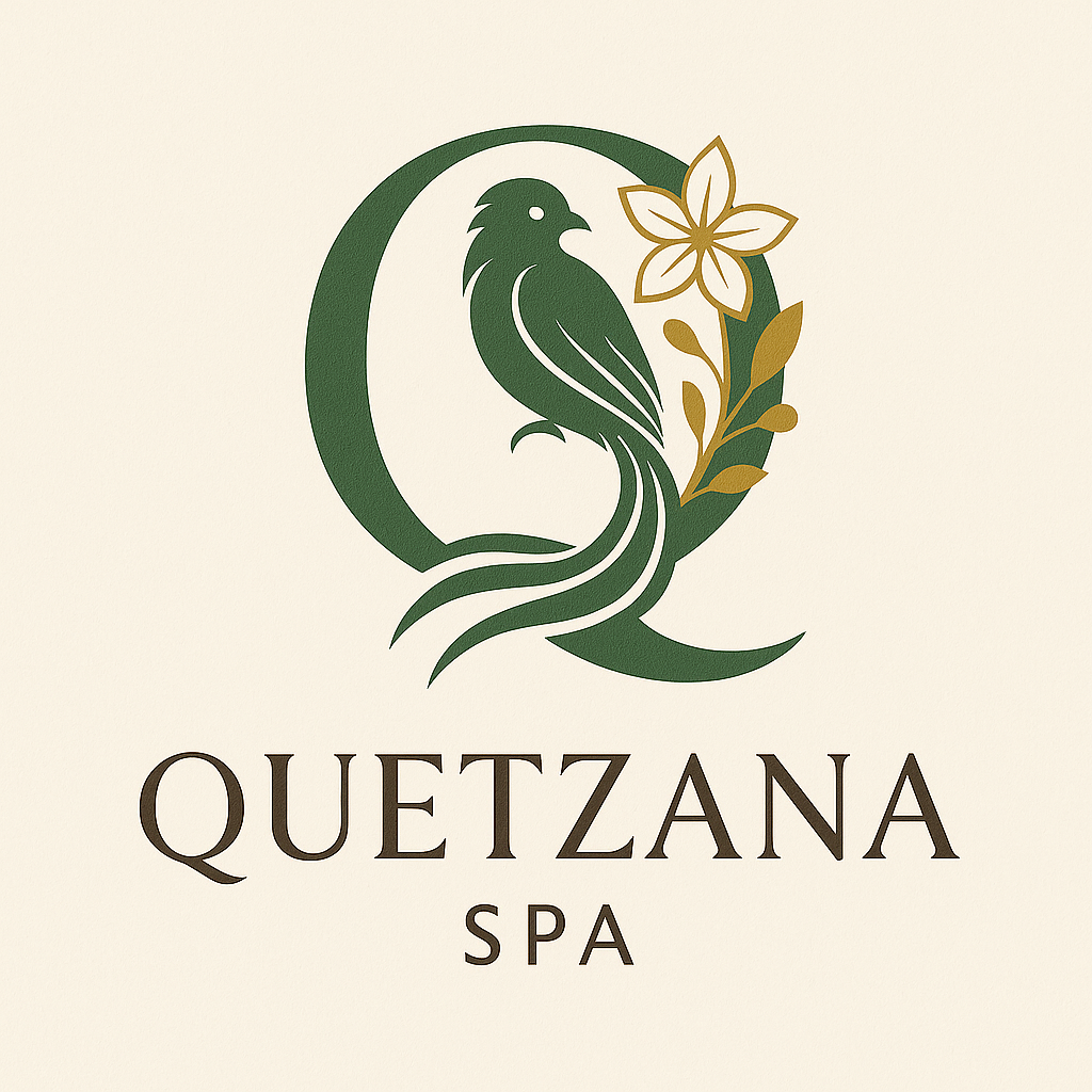
Quetzana
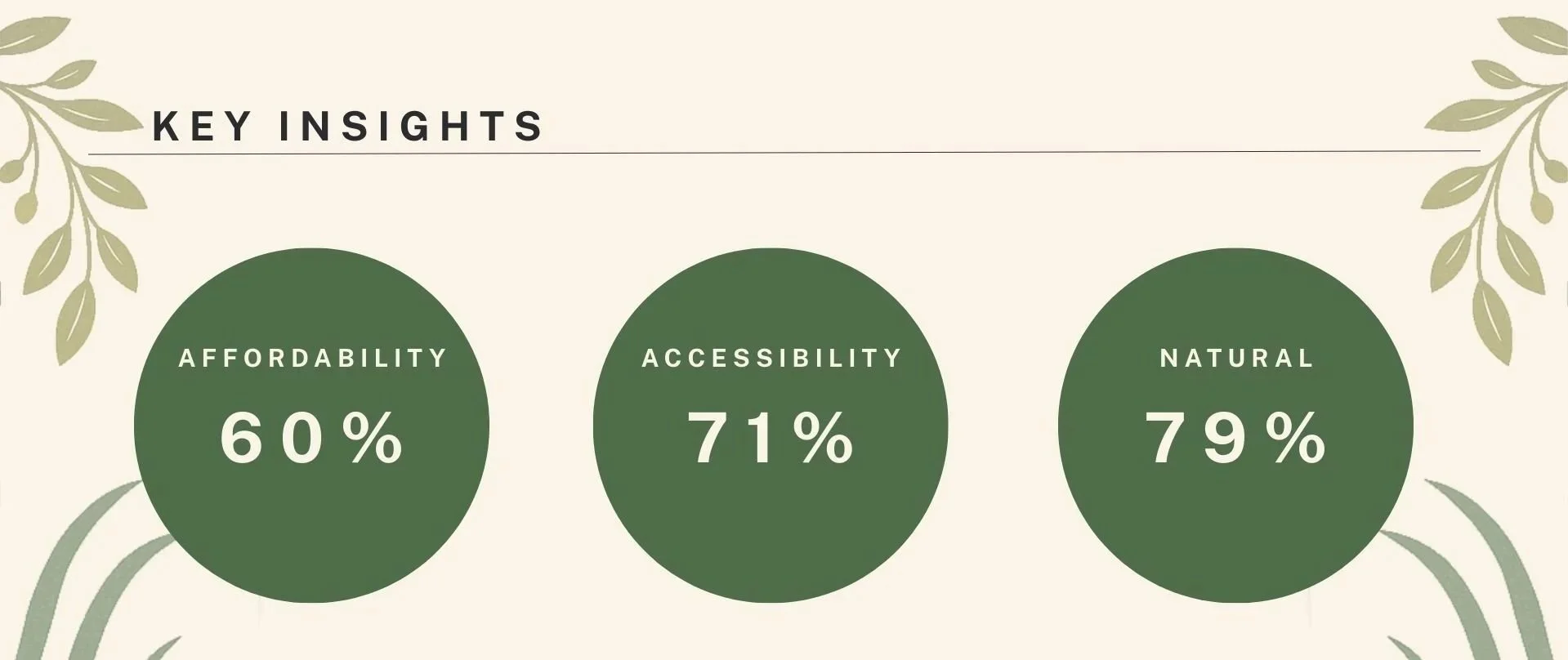
Affordable. Accessible. Natural.
A culturally rooted wellness brand designed to make self-care feel inclusive, transparent, and attainable—without sacrificing beauty, intention, or ritual.
BRAND OVERVIEW
Quetzana is a wellness brand concept created in response to a growing disconnect between modern wellness culture and the real needs of women. While wellness is often marketed as aspirational and luxurious, many women experience it as inaccessible, overpriced, and lacking transparency.
Quetzana reimagines wellness as ritual—grounded in nature, cultural knowledge, and everyday accessibility. The brand centers affordability, ingredient transparency, and emotional safety, offering a softer, more inclusive alternative to traditional spa and self-care spaces.
THE PROBLEM
Wellness is frequently positioned as a luxury—exclusive, expensive, and disconnected from real bodies and real lives. Research revealed that cost, lack of transparency, and emotional exclusion are some of the biggest barriers preventing women from maintaining consistent self-care routines.
These are the common barriers that most of the survey respondents identified as barriers. I had 37 respondents in this survey.
Key challenges identified:
Wellness spaces feel financially out of reach
Natural and transparent products are often overpriced
Many spaces lack cultural awareness, inclusivity, and emotional safety
RESEARCH & INSIGHTS
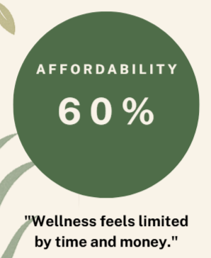
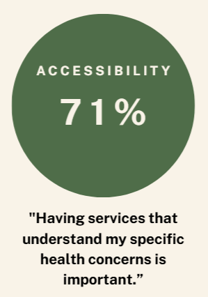
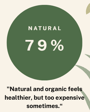
Quetzana was informed by survey research with 39 female respondents across a broad age range. The findings revealed consistent desires for wellness experiences that are affordable, transparent, natural, and emotionally supportive.
Key insights:
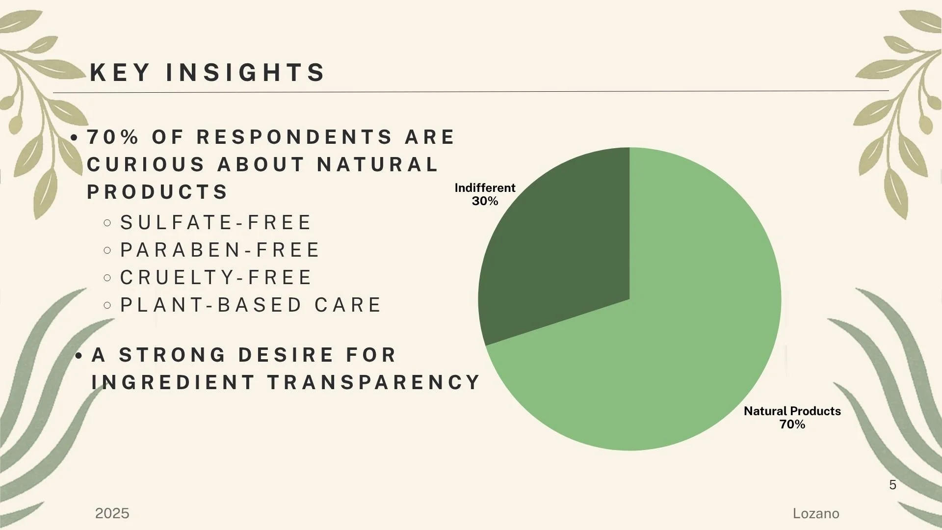
70% expressed curiosity about natural products
76% emphasized ingredient transparency
Cost and time were the most significant barriers to wellness
Respondents sought inclusive, trauma-informed, body-positive spaces
These insights shaped both the brand’s values and its visual language.
BRAND POSITIONING
Quetzana occupies the space between clinical wellness and luxury spa culture. It is neither medicalized nor indulgent—it is intentional, grounding, and human.
Positioning statement:
An inclusive, nature-rooted wellness brand where healing becomes ritual, not luxury.
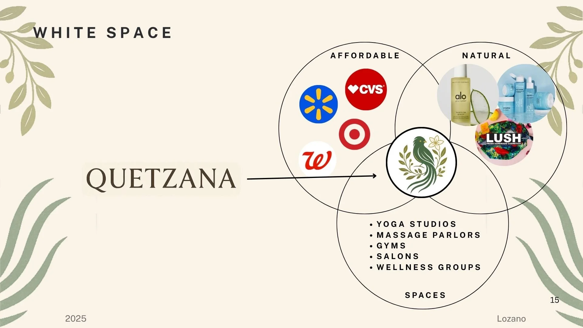
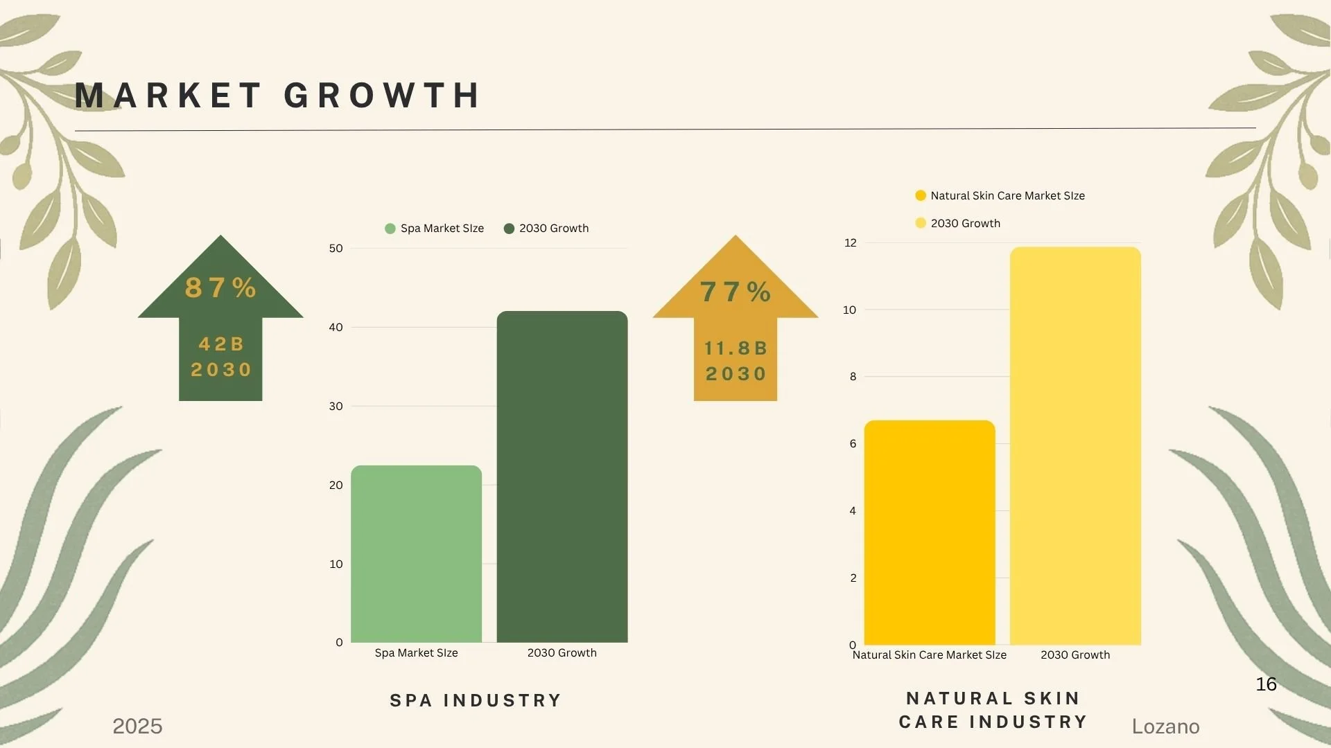
The market growth data and white space analysis reveal a clear positioning opportunity—an expanding wellness industry that lacks accessible, natural, and inclusive offerings. Quetzana is designed to occupy this intersection.
BRAND TARGET AUDIENCE
Quetzana was designed for women seeking wellness that honors their bodies, identities, and lived experiences—without financial pressure or aesthetic intimidation.
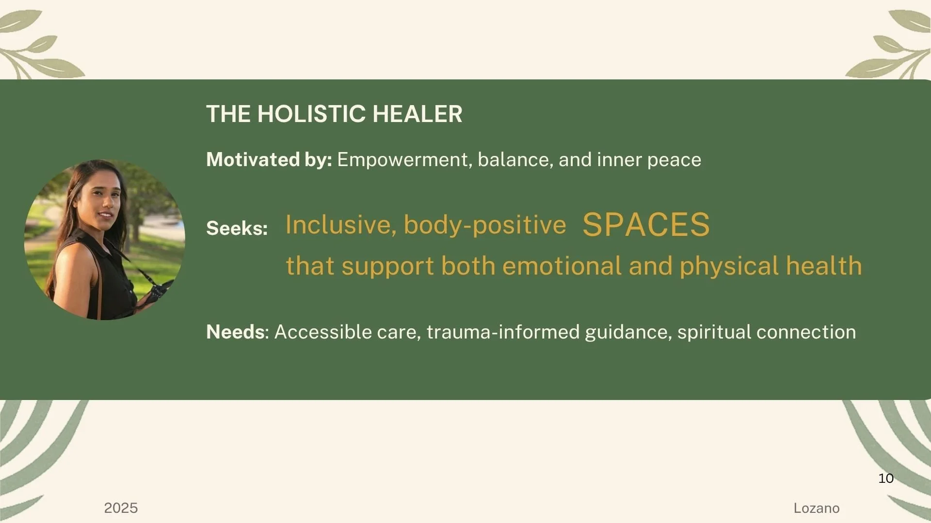
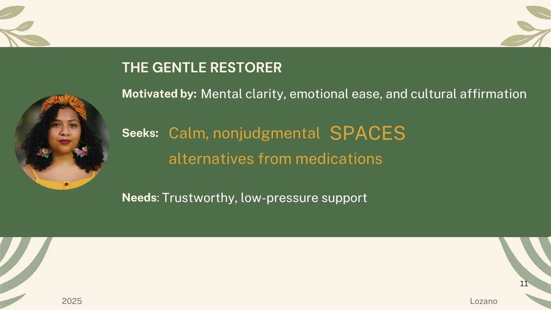
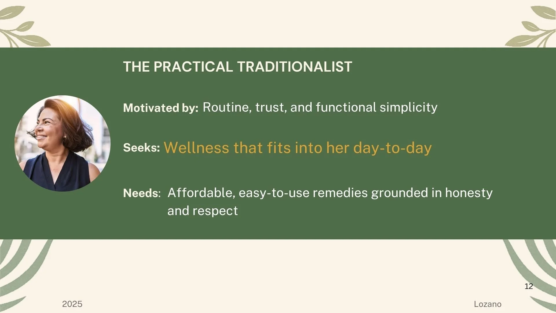
Each persona values affordability, emotional safety, and natural care, but engages with wellness in different ways.
BRAND STRATEGY
Quetzana was designed for women seeking wellness that honors their bodies, identities, and lived experiences—without financial pressure or aesthetic intimidation.
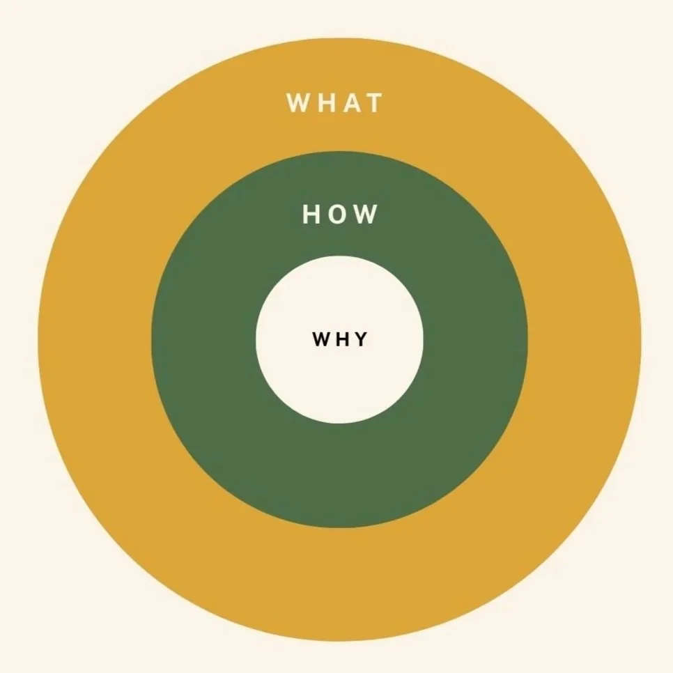
What
A subscription-based wellness spa experience offering customizable rituals, natural products, and community-centered care.
How
Through accessible memberships, DIY treatments rooted in tradition, trauma-informed care, and transparent, sustainably sourced products.
Why
To create inclusive, affordable, and culturally rooted wellness spaces where healing becomes ritual—not luxury.
NAMING & STORY
The name Quetzana draws from both cultural symbolism and linguistic softness.
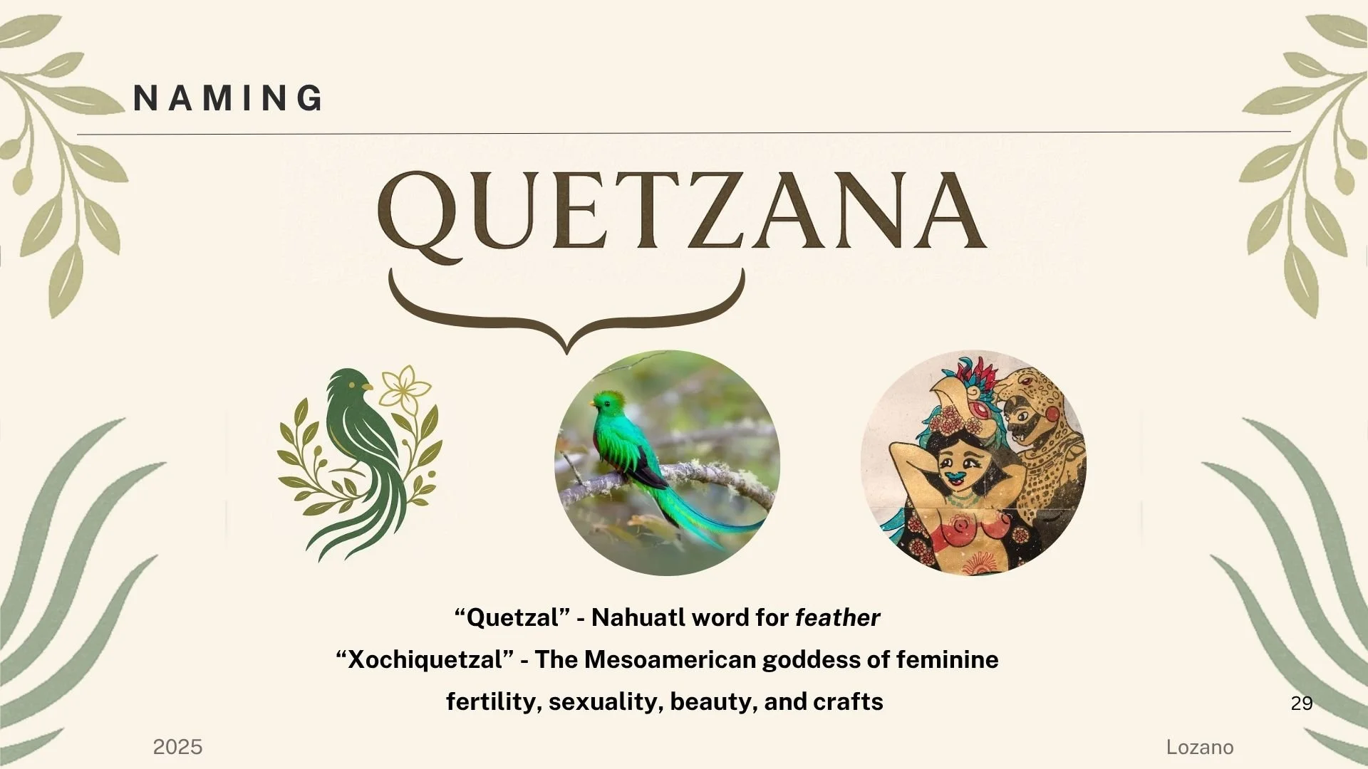
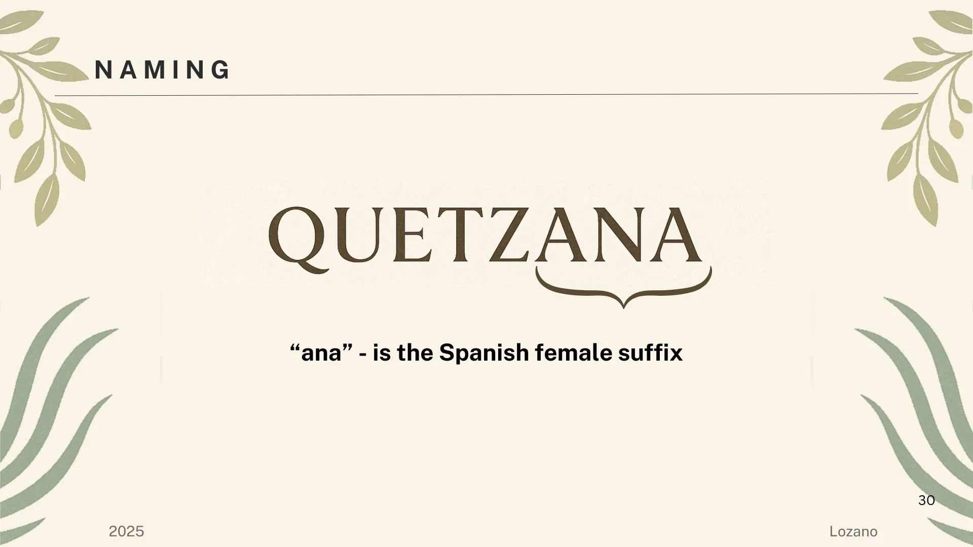
Together, the name reflects ritual, femininity, and natural balance.
VISUAL IDENTITY
The visual identity balances softness and grounding—drawing from botanical forms, earth-toned palettes, and elegant serif typography. The system was designed to feel calm, trustworthy, and quietly empowering.
Key elements:
Warm neutrals with deep green accents
Organic illustration and framing
Serif typography evoking ritual and tradition
Minimal, breathable layouts
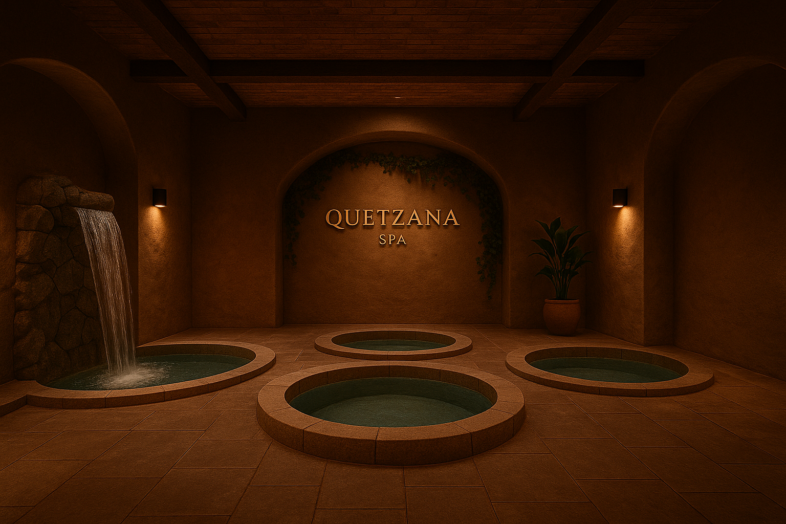
BRAND APPLICATIONS
Quetzana was designed as a scalable brand system capable of expanding across physical spaces, products, and digital touchpoints.
Potential applications include:
Wellness spa environments
DIY treatment bars
Juice & tea offerings
Product packaging
App and membership experience
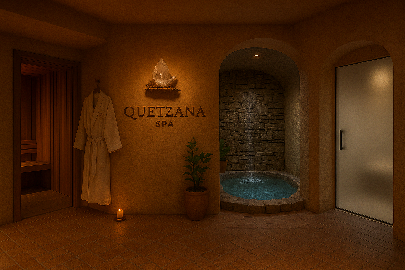
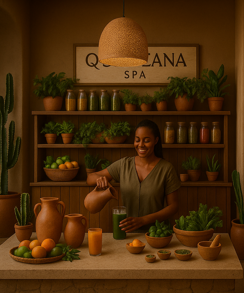
DIY Spa Treatments and Juice Bar
Juice Bar
All natural smoothies, juices, and teas
Full transparency of ingredients
Ethically sourced
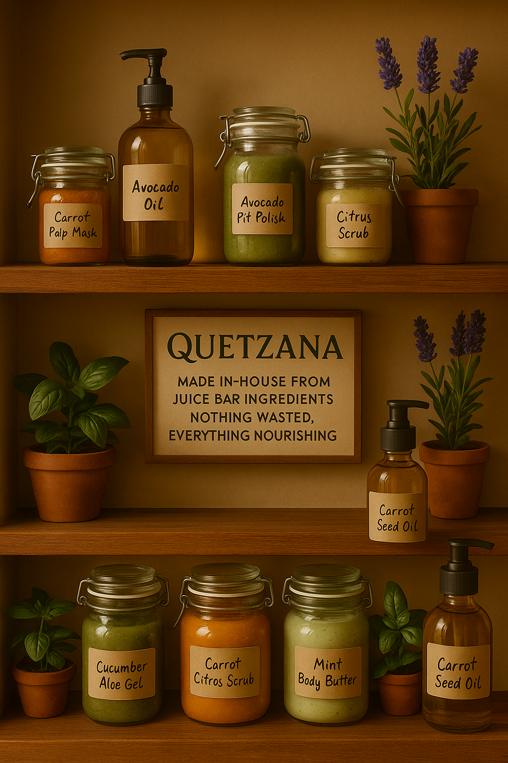
DIY Spa Treatments
Fully customizable natural spa treatments
Products resourced from excess Juice Bar inventory
0 waste practice
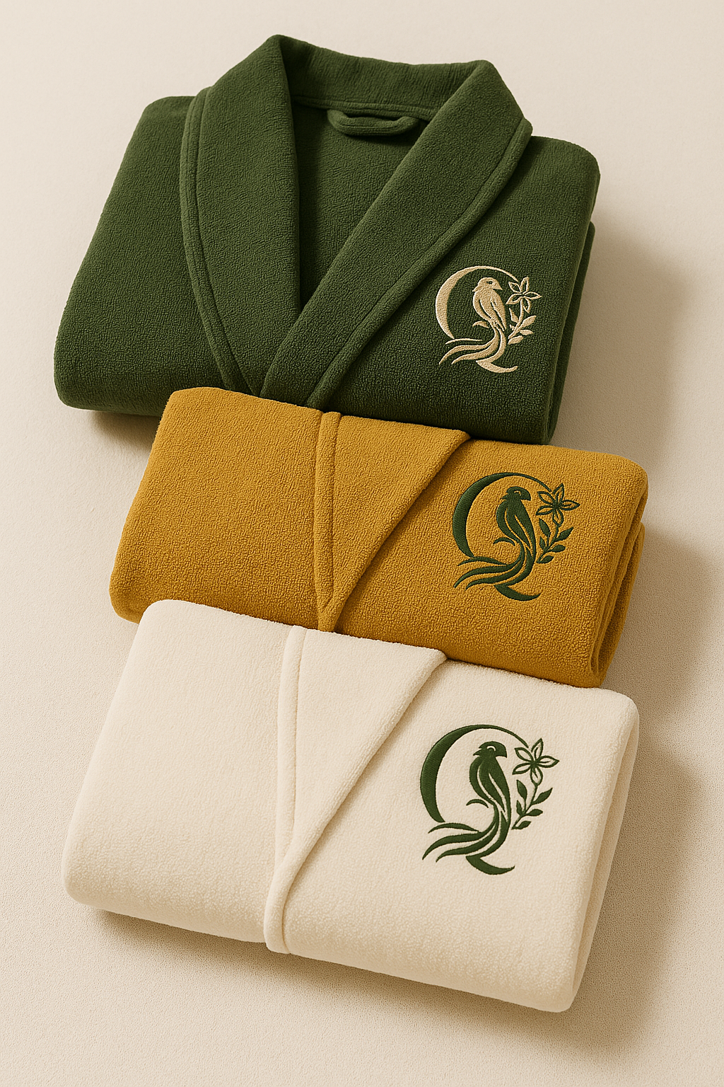
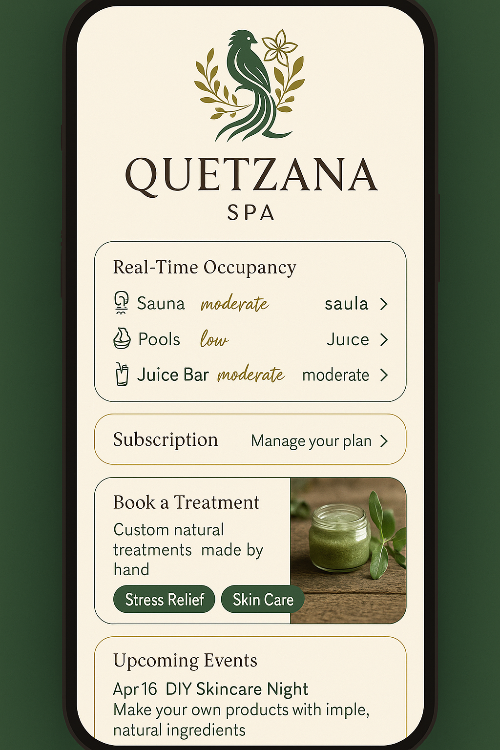
App and Products
App:
manage your subscription
book treatments
check how busy the amenities are
Subscription:
complimentary Quetzana-branded robe
color robe matches your tiered subscription
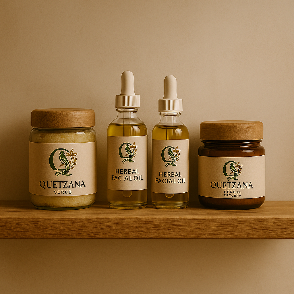
Products:
all-natural skin care products made in-house
refills available when the container is brought back
CONCLUSION
This project explores how branding can function as an act of care—shaping not only perception, but access, trust, and emotional safety. Quetzana challenged me to design a brand that feels both aspirational and attainable, rooted in beauty without exclusion.
-
Future iterations explore market insights, retail partnerships, and digital brand extensions.